So, I felt like it would be appropriate to discuss my first copy of the book for my first real blog post.
Back in 1991, we were at North Hills Mall. It was a local mall that we frequented fairly often on Friday nights. We’d meet my Dad after work and go to Luby’s Cafeteria. In fact, it was at this very Luby’s in 1992 that my Dad convinced me (to my mother’s chagrin) to stand on the table and belt out “Meet Me in St. Louis” to the restaurant. I got $6 in tips that night. Sometimes, I miss being cute.
But I digress, it was on one of those nights that the Friends of the North Richland Hills Public Library were having their annual book sale. My family has always been big on books. I started reading at about age 4 on my own. My Mom had a collection of Bobbsey Twin books, and Dad had a ton of his own. Reading was always encouraged. [Edit: Mom informs me that I actually was reading on my own at age 3, before I was fully potty trained. Clearly I had priorities.]
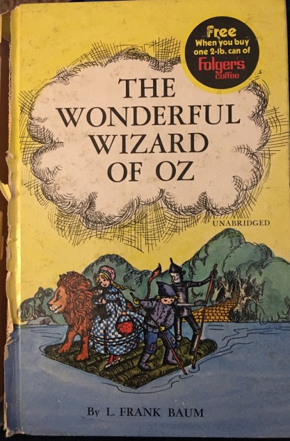
By this point, I was well aware of the MGM film. And by well aware I mean “hard core obsessed to the point of annoying anyone around me.” So while we were there, I found a copy of The Wonderful Wizard of Oz. This was my first edition of the book.
Not long after, my grandmother (Nannie) would start reading the book to me, usually 1-2 chapters every time I spent the night with her (usually on Saturdays). And that was my first introduction.
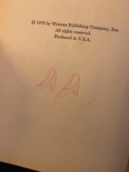
This edition was first published by Whitman in 1970. From what I can tell, this is their second edition of the book. There is one earlier edition with two printings with different illustrations.
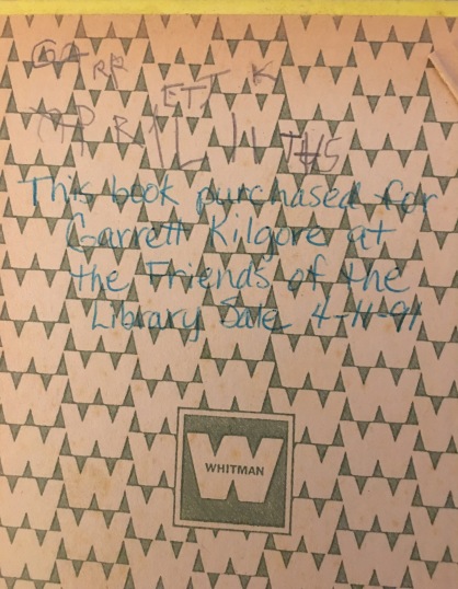
This edition was offered both individually and a Folger’s premium, both in hardback. There are at least two variants of the Folger’s offer (which probably would date it further if I could find an advertisement) as well as an edition without the Folger’s offer (I do not have that edition). My assumption is the 2-lb. offer was probably printed first, since it has the traditional Whitman endpapers (as seen above), where the Vacuum Coffee offer features blank endpapers.
There was a soft back release in 1979 as well.

The illustrations in this edition are by Erika Markling. They are attractive enough, printed all in green ink. However, she chose some very interesting things to illustrate. Of the eleven illustrations none are of the Cyclone, or the Wicked Witch of the West or Glinda. Instead, she focused on the Winged Monkeys, the Hammerheads, and the Forest of the Fighting Trees. Additionally, while she did illustrate the meeting of Tin Woodman and Cowardly Lion but she did not illustrate the meeting of Scarecrow.

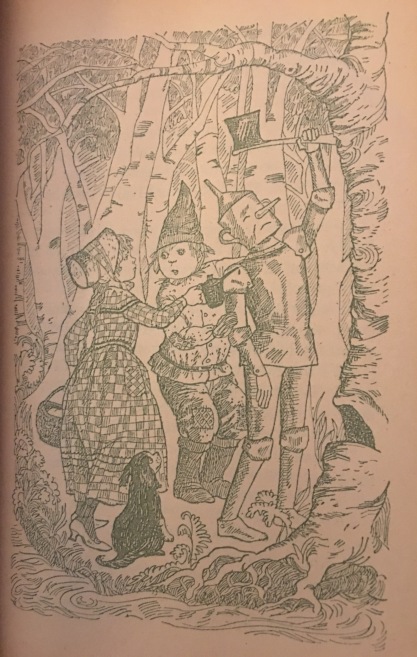


If I’m honest, while the illustrations are attractive, they’re not my favorites. I frequently feel like the background is too crowded, and the fact she chose to not illustrate some of the bigger moments is a bit of a let down.
So, there you have it. My first edition of The Wonderful Wizard of Oz. This is kinda where the book collecting began.
What was your first edition? What’s your take on Markiling’s illustrations? Is there another variant I don’t know about? Let me know in the comments!

Gosh. I haven’t thought about the Whitman edition in a really long time! I have it…somewhere…in a box, probably. I don’t remember the illustrations terribly well, but it’s funny you mentioning that Markiling didn’t show “the bigger moments” – when I was a kid, the bigger moments *were* things like the Fighting Trees and the Hammerheads, because there was no movie version to show me those episodes. They were, for me, somehow more exciting because they could be literally anything, whereas most interpretations of the Witches tended to look…well, similar.
My first edition would undoubtedly have been Michael Hague’s. My mother was very into prestige books when I was a kid, and the late ’80s / early ’90s were a great time for easily available, beautifully illustrated children’s classics. I had several other Hague books, both picture books and classics like “Alice” and “The Wind in the Willows,” so it would have been a natural choice. I don’t think it’s a perfect edition, but I have a lot of nostalgia for it – it’s colorful and bright and very encompassing. It’s also the only edition I have signed by the illustrator – I met him a few years later, and he drew a marvelous Scarecrow in my book – so that’s special to me, as well.
LikeLiked by 1 person
I can definitely appreciate that she chose to illustrate those moments, I think my frustration is not with the decision to do those, so much as I want more. I know they say to always leave them wanting more…but in this case, I would *love* more.
I actually didn’t get the Hague until towards the end of elementary school, although I did check it out from our library (and eventually got that exact copy) so I was definitely familiar with it. While I don’t like his illustrations for Oz much (as I’ll discuss eventually) there are elements of his that influenced my own artwork as a kid, and I do love some of the other books he illustrated.
LikeLike
My first copy of the book was the Charming Classics edition, which was paperback and came with a necklace with a Ruby Slippers charm. It doesn’t have any illustrations, but I remember spending a lot of time analyzing the cover… Dorothy didn’t look like Judy Garland, but she definitely looked older than Baum wrote her. Her dark black hair made her look Hispanic or Native American to me, and I thought the Emerald City looked odd. I think the next copy I ever got was either the Charles Santore edition or the Robert Sabuda illustrated pop-up book, which I really loved because the art was amazing and the book was easier and more fun to read.
LikeLike
I have that one somewhere…maybe? I think I may have picked it up in college and may actually have discarded it because of the lack of interior pictures. I did like the vaguely ethnic Dorothy though.
The Santore edition is one of my absolute favorites of all time. It’ll warrant at least a post…or five…and possibly a big ol’ love letter.
LikeLike
Never heard of this illustrator or seen those pictures before, but it’s nice how she actually depicted Dorothy and Toto playing, a rarely-seen moment shown in the books.
There is a lot of detail in the pictures, but some of the angles are off (like Dorothy’s upper body as she’s walking through the Emerald City, when we’re looking at her from above).
Still, not so bad!
LikeLike
There is a tremendous amount of detail in the art! And I totally agree, the first illustration in the book is probably my favorite in the entire book.
LikeLike